Home-field Advantage
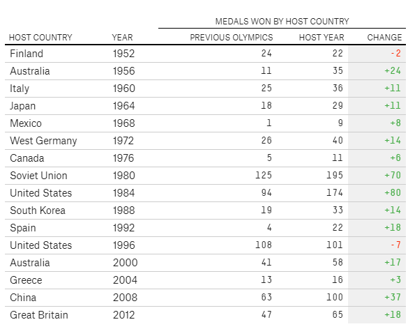
Similar to the attempt at showing female participation, simple and basic tables were utilized to examine the existence of home-field advantage at the Olympics (Pettigrew & Reiche, 2016). See Figure 4.

Figure 4: Medals won by host countries at host year and the previous Olympics, Pettigrew & Reiche (2016)
This visualization shows a table comparing the total number of medals earned at the host year and the previous Olympics. Changes between the two were shown in the last column. Among the 16 host countries from 1952 to 2012, only two countries showed negative changes, meaning that hosting the Olympics helped the country earn more medals. However, the problem with this method is that it is a little bit arbitrary to compare the host year and the adjacently previous Olympics. Changes might have been positive simply because these countries did not perform well only in the previous Games, even though they had performed well eight or more years before the host year. Therefore, it is a more robust choice to show these countries’ Olympic performances in all years.
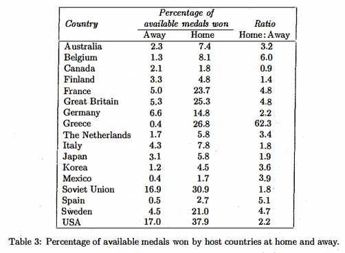
Clarke (2000) did this by calculating the “Home: Away Ratio”. See Table 2.

Table 2: Percentage of available medals won by host countries at home and away, Clarke (2016)
He listed the percentage of all available medals won by countries that have ever hosted an Olympic both at the Home years and the Away years. The ratio of “Home: Away” was calculated. Obviously, a ratio larger than 1 indicates the existence of home-field advantage at the Olympics. The drawback of this method is that it only shows the summary of all the years, lacking information about these countries’ performance in each year.
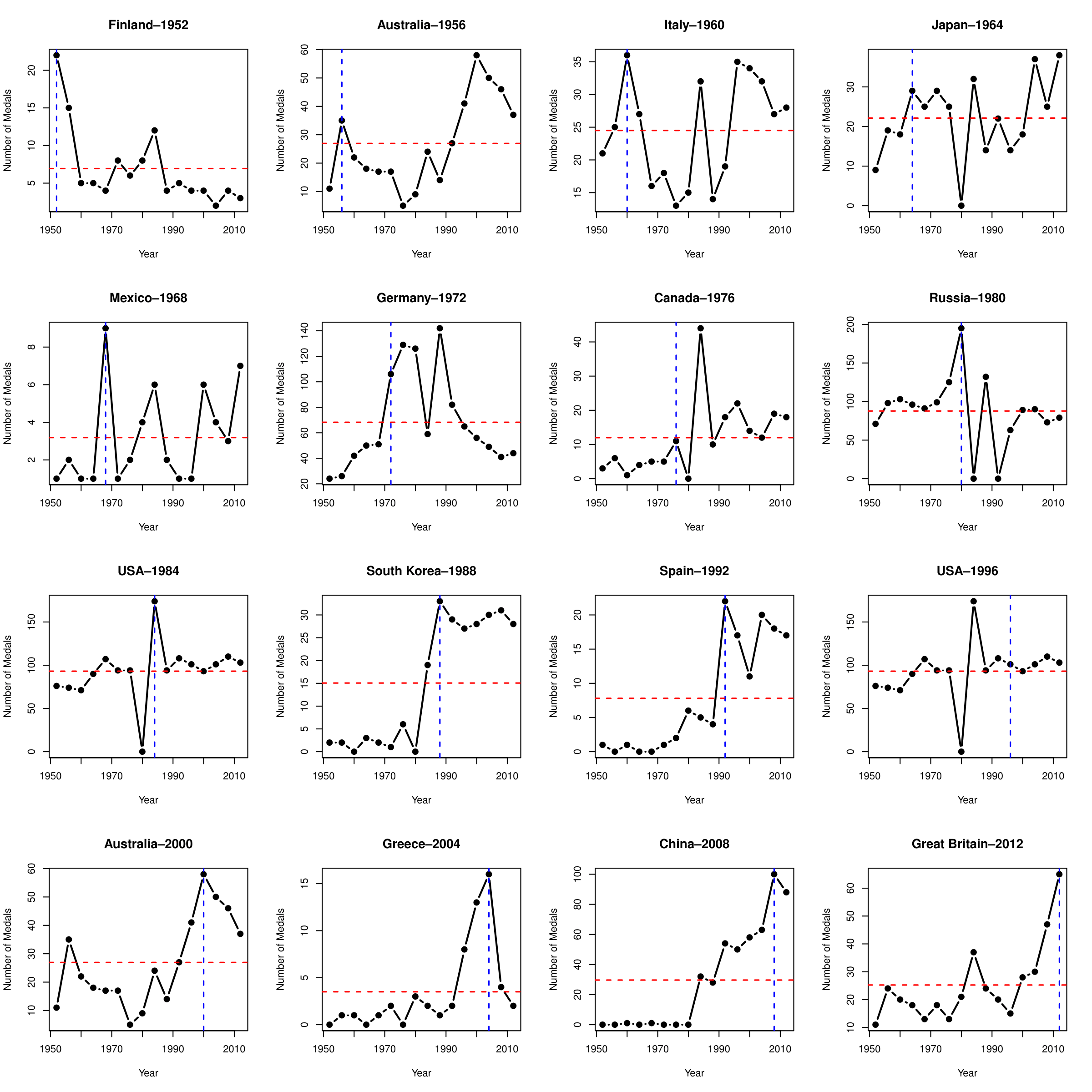
Visualizations showing all the years do exist (Grange, 2016). See Figure 5.

Figure 5: Visualizing home-field advantage by Grange (2006)
For example, in this small multiple made by R, each graph has a blue vertical line emphasizing the number of medals earned during the host year, and a red horizontal line indicating the total average. It is very effective in the sense that it clearly compares the performance during the host year and all other years. The problem with this method is that lines are not very good at showing density distribution of medal numbers over the years. To improve this drawback, we decided to use kernel density estimation (KDE) coupled with small multiples.